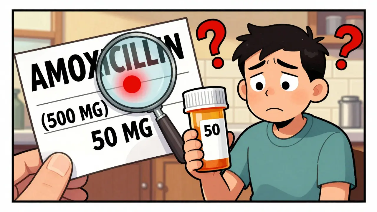
Every year, thousands of patients are at risk of receiving the wrong medication-not because of a mistake in dosage, but because two drug names look or sound almost identical. This is called a look-alike, sound-alike (LASA) error. One of the most effective, low-cost tools to prevent these mistakes is tall-man lettering. It’s not fancy. It doesn’t require new machines or expensive software. All it does is change how drug names are written on screens, labels, and prescriptions. And it works.
What Is Tall-Man Lettering?
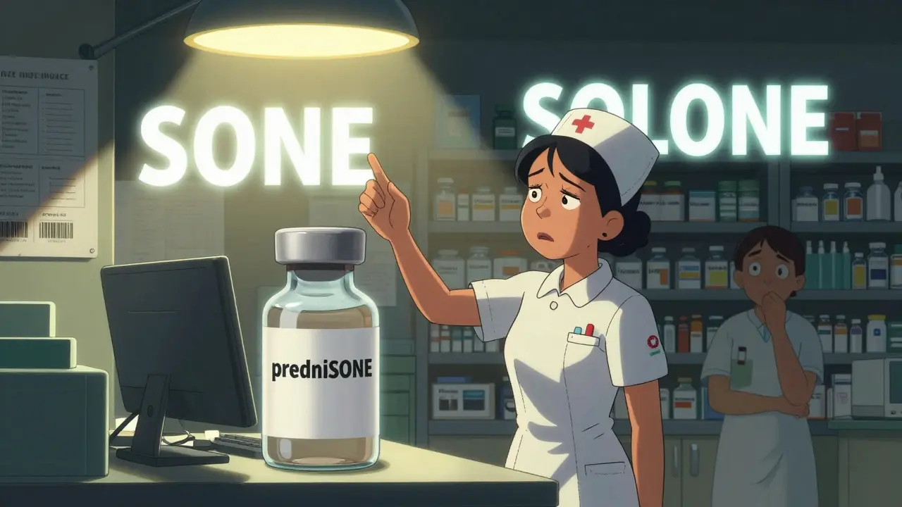
Tall-man lettering is a simple typographic trick: you capitalize the parts of drug names that are different. For example, instead of writing "prednisone" and "prednisolone," you write "predniSONE" and "predniSOLONE." The capitalized letters-"SONE" and "SOLONE"-jump out visually, making it easier to spot the difference at a glance.This method was first introduced by the Institute for Safe Medication Practices (ISMP) in 1999. Since then, it’s been adopted by hospitals, pharmacies, and clinics across the U.S., Australia, New Zealand, and parts of Europe. The U.S. Food and Drug Administration (FDA) started officially recommending tall-man lettering in 2001, and today, over 89% of U.S. hospitals use it in their electronic systems.
The goal? Cut down on the roughly one medication error per 1,000 prescriptions that happen because of confusing drug names. In emergency rooms, busy pharmacies, or during night shifts, when staff are tired and under pressure, this visual cue can be the difference between safe care and a dangerous mistake.
How It Works: Real Examples
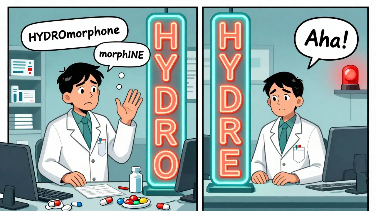
Not all drug name pairs need tall-man lettering. Only the ones that are commonly confused. Here are a few real-world examples used by the FDA and ISMP:- HYDROmorphone vs. morphINE - The capitalization highlights "HYDRO" and "INE," the key differences.
- vinBLAStine vs. vinCRIStine - The "BLA" and "CRI" stand out clearly.
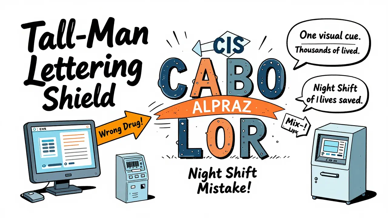
- CISplatin vs. CARBOplatin - "CIS" and "CARBO" are emphasized.
- ALPRAZolam vs. LORazepam - "ALPRAZ" and "LOR" help separate them.
These aren’t arbitrary. They’re based on decades of data from actual medication errors. The ISMP maintains a public list of 252 drug pairs that should use tall-man lettering, updated every quarter. The FDA has a slightly smaller list of 72, but both agree on the most dangerous pairs.
Even brand names get this treatment. For example, "PARoxetine" and "FLUoxetine" are both written with tall-man lettering to avoid mix-ups between these two antidepressants. In one hospital, a nurse almost gave a patient the wrong one-until the capitalized "PAR" and "FLU" made her pause and double-check.
Why It Works: The Science Behind the Letters
You might think, "Isn’t this just about capital letters? How much difference can that make?" But research shows it’s more powerful than it looks.A 2004 eye-tracking study by ISMP found that when pharmacists and nurses were shown two similar drug names-one in standard lowercase, one with tall-man lettering-they were 35% faster and more accurate at picking the right one. Their eyes naturally zeroed in on the capitalized sections. It’s not magic. It’s how the human brain processes visual information. We scan for patterns, and when a word breaks that pattern with bold capital letters, our attention snaps to it.
Another study published in 2022 in Pharmacology Research & Perspectives tracked a hospital that implemented tall-man lettering across 13 different systems. After the change, they saw a 42% drop in overridden safety alerts for LASA drugs in just six months. That means fewer mistakes slipped through because staff were more confident in what they were seeing.
It’s especially helpful in fast-paced environments. Think of a nurse rushing to give medication before a surgery. Or a pharmacist filling 150 prescriptions in a shift. There’s no time to read every name slowly. Tall-man lettering gives them a split-second visual signal.
Where It’s Used
Tall-man lettering isn’t just on paper. It’s built into the digital tools that healthcare workers use every day:- Electronic Health Records (EHRs) - When a doctor types in a drug name, the system auto-formats it with capital letters.
- Automated Dispensing Cabinets - The names on the screens inside these machines use tall-man lettering so nurses can pick the right one quickly.
- Prescription Labels - Both printed and digital labels for patients show the formatted names.
- Barcodes and Scanners - Even the barcode systems are programmed to recognize and display the tall-man version.
It’s also used in drug packaging, especially for high-risk medications like insulin, opioids, and anticoagulants. In fact, the Joint Commission requires hospitals to use methods like tall-man lettering to reduce LASA errors as part of their National Patient Safety Goals.
The Challenges: When It Doesn’t Work
Tall-man lettering isn’t perfect. And it’s not a cure-all. Here are the biggest problems:1. Inconsistent Implementation
One hospital might use "PARoxetine" while the pharmacy down the street uses "paroxetine." A patient might get a prescription from one system, then fill it at a pharmacy that doesn’t use the same formatting. In a 2023 survey, 63% of pharmacists said they’ve seen different tall-man patterns across systems-creating more confusion than clarity.
2. Font Size and Screen Quality
On small screens, especially in older EHRs or mobile devices, the capital letters can blend in if the font is too small or the contrast is poor. One physician on Reddit wrote: "I mix up ALPRAZolam and LORazepam because the capitals are too faint on my tablet."
3. Not All Names Can Be Differentiated
Some drug names are too similar at the start. For example, "metoprolol" and "methyldopa"-the differences are in the first few letters. Tall-man lettering can’t help much there. In those cases, other safety measures like barcode scanning or independent double-checks are more effective.
4. False Sense of Security
Some experts, like Dr. Robert Wachter, warn that relying too much on tall-man lettering can make staff think they’re safe, when they should be using multiple layers of protection. It’s one tool, not the whole toolbox.
How to Implement It Right
If you’re part of a hospital, pharmacy, or clinic looking to adopt tall-man lettering, here’s what actually works:- Form a team. Include pharmacists, IT staff, nurses, and physicians. This isn’t just an IT project-it’s a safety culture project.
- Use the ISMP or FDA list. Don’t guess. Start with the official recommended drug pairs. The ISMP list has 252; the FDA has 72. Both are free to download.
- Update all systems at once. If you change it in the EHR but not in the dispensing cabinet, you’ll create inconsistency. Coordinate with all vendors.
- Train everyone. Don’t assume staff know why the letters are capitalized. Show them examples. Explain how it prevents errors.
- Monitor and adjust. Track how many LASA-related alerts are still being overridden. Survey staff for feedback. Make tweaks as needed.
According to HIMSS, implementing tall-man lettering across a 500-bed hospital takes about 16 weeks. The cost? Around $1,200 per system in Australia. In the U.S., most EHR vendors like Epic, Cerner, and Meditech include it as a standard feature.
The Bigger Picture: It’s One Piece of Safety
Tall-man lettering isn’t the solution to every medication error. But it’s one of the most reliable, low-cost tools we have. As Dr. Michael Cohen of ISMP says, it’s "one essential layer in our defense-in-depth approach."Think of it like seatbelts. They don’t prevent every car crash. But when you’re in a collision, they dramatically improve your odds of walking away. Tall-man lettering does the same for medication safety.
When combined with barcode scanning, independent double-checks, clear communication, and automated alerts, it becomes part of a powerful safety net. And in a world where one wrong pill can change a life, that net matters.
What’s Next?
In early 2023, the FDA and ISMP announced they’re working together to create a single, unified tall-man lettering list by mid-2024. This will finally end the confusion caused by different organizations using different rules.Some hospitals are even testing AI-powered versions. Epic Systems is piloting a system that learns from real-time error data and adjusts capitalization patterns to make the most confusing pairs stand out even more. Early results show a 29% greater reduction in errors compared to static formatting.
But even with all this tech, experts agree: as long as humans are reading and selecting drug names, tall-man lettering will stay relevant. It’s simple. It’s visual. And it works.
What is the main purpose of tall-man lettering in medication safety?
The main purpose of tall-man lettering is to reduce errors caused by look-alike, sound-alike (LASA) drug names by using selective capitalization to highlight the key differences between similar medication names. This visual cue helps healthcare providers quickly and accurately distinguish between drugs like predniSONE and predniSOLONE, reducing the risk of wrong-drug administration.
Which organizations recommend tall-man lettering?
The Institute for Safe Medication Practices (ISMP) and the U.S. Food and Drug Administration (FDA) are the two primary organizations that recommend and maintain official lists of drug names requiring tall-man lettering. The ISMP list includes 252 drug pairs, while the FDA list includes 72. Both are widely adopted in hospitals and pharmacies across the U.S., Australia, and New Zealand.
Does tall-man lettering reduce actual patient harm?
Evidence suggests tall-man lettering reduces the number of selection errors during prescribing and dispensing, but its direct impact on preventing patient harm is less clear. A 2022 Cochrane review rated the evidence for reducing actual harm as "low certainty." It works best as part of a broader safety strategy that includes barcode scanning, double-checks, and electronic alerts.
Why do some hospitals still have errors even with tall-man lettering?
Errors persist when tall-man lettering is inconsistently applied across systems-like when one EHR uses "PARoxetine" and another uses "paroxetine." Font size, screen quality, and lack of staff training also reduce effectiveness. It’s not a standalone fix; it needs to be part of a complete safety protocol.
Can tall-man lettering be used for brand names too?
Yes. Brand names that are easily confused with other drugs also use tall-man lettering. For example, "PARoxetine" and "FLUoxetine" are both formatted with capital letters to prevent mix-ups. Many hospitals apply the same rules to brand and generic names to ensure consistency across all medication labels and systems.


Lisa Fremder on 27 February 2026, AT 10:17 AM
This tall-man lettering crap is just another government waste of time. We’ve got real problems like drug shortages and nurse burnout, and we’re worrying about capital letters? Stop the performative safety theater.